MyFitnessPal is a smartphone app and website that tracks nutrition and exercise to determine the optimal caloric intake and macros for user goals and uses gamification elements to motivate users.
Once upon a time, I used MyFitnessPal religiously. I recently redownloaded the app and noticed that there hadn’t been any meaningful UI/UX updates since I last used it almost 10 years ago. This case study was a chance for me to see how the user experience of the app could be improved for today’s users.
The Process
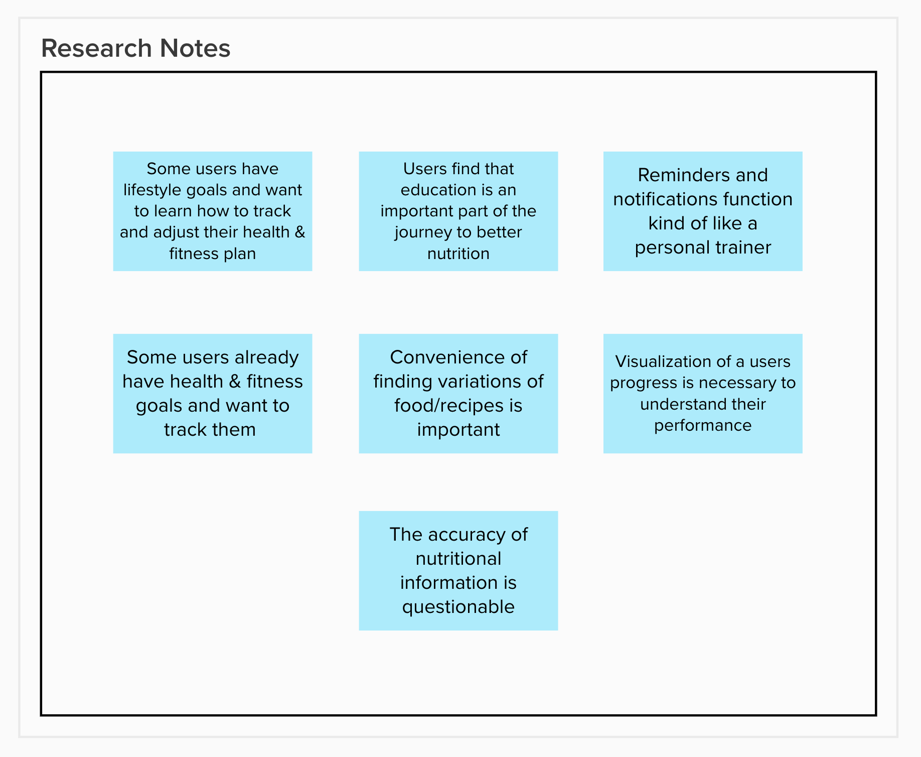
I started my discovery phase by interviewing 7 people who live generally active lifestyles. I made sure to include people who use MyFitnessPal and people who used other types of fitness tracking applications and wearables.
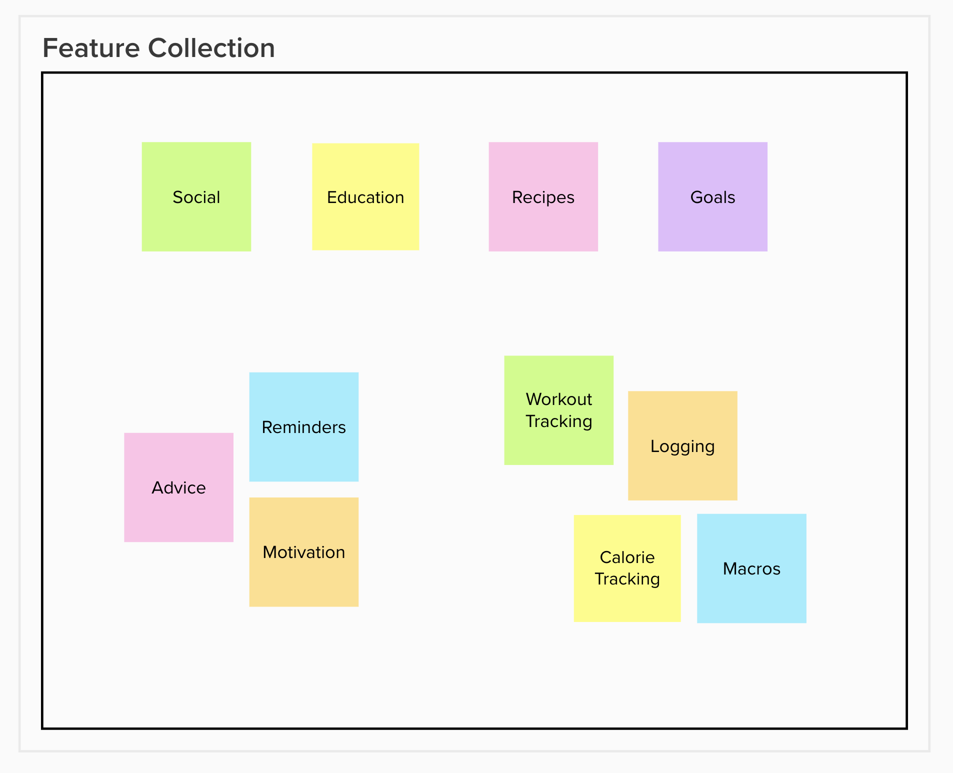
Synthesis of the research and the most used features of the app led me to a set of key findings and design principles. After finalizing my takeaways, I continued into the ideation phase by breaking down the information architecture and user flow, then building up a set of low fidelity wireframes.
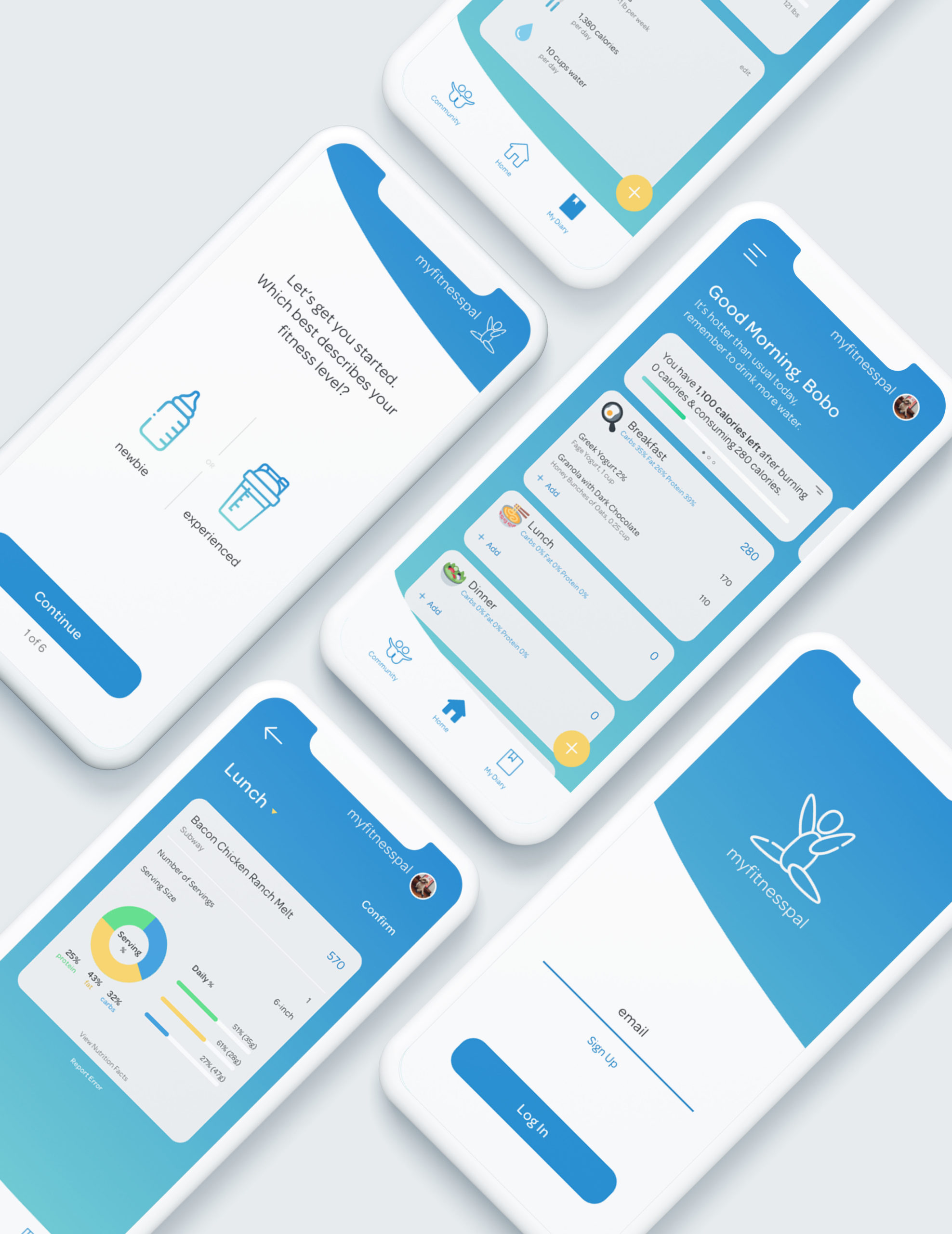
Using my low fidelity wireframes, I did a few rounds of concept testing with the same people I interviewed initially. Then, with the feedback from these sessions, I built out my high fidelity prototypes.
As it turns out, my main focus turned into creating a better onboarding experience for both fitness newbies and fitness enthusiasts. In my interviews, I heard a lot about the different levels of knowledge and tracking needs when it comes to nutrition. I also made minor changes to the main menu to simplify navigation and help users get to their main tasks as quickly as possible.
While my improvements were minor, I think the workflow was streamlined and the design more modern. The major differentiator was in onboarding new users and catering to the different needs of new and experienced users.